
The Women’s March logo has come under fire from those involved in organising against trans people’s equality. This because they’ve apparently put a man in it, and by which they mean a transgender woman. Hilarity has of course, ensued.
I love this story because it reveals so much about the deeply held misogyny of anti-trans activism. But we’ll get to that in due course, for now lets get the basics out of the way. Women’s March began five years ago in 2017 and state their mission goal as being “to harness the political power of diverse women and their communities to create transformative social change.”
The Women’s March logo has always been 3 silhouetted side-profiles of faces laid on top of each other like playing cards, this to represent the diverse women in their mission statement. It was recently updated to be similar, though noticeably different.
Most noticeable is the colour scheme which has changed from the red, dark blue and off-white shades to a less vibrant and – in my personal opinion – less revolution poster styled colour scheme of blue and white. The second change I noticed was that the new version does not have long eyelashes included in the silhouette, the third change being a different hairstyle for the right-most silhouette.
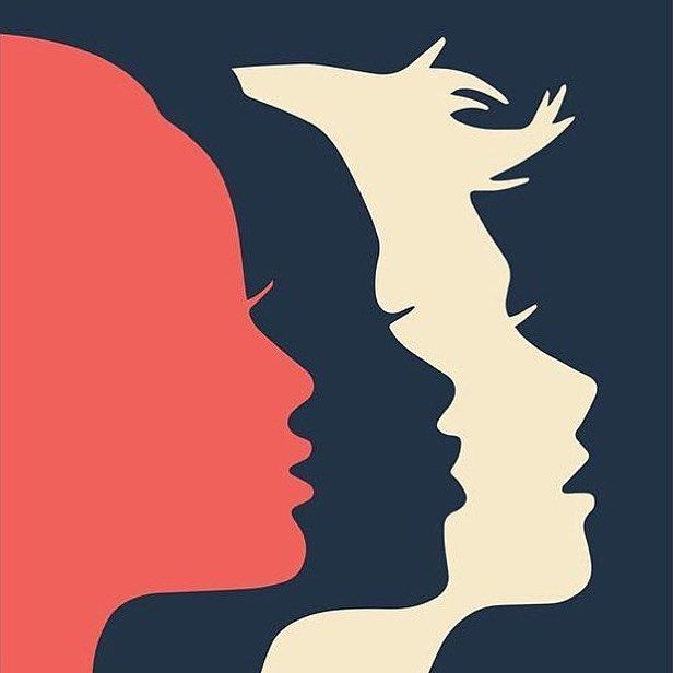
Finally, and this is the controversial one according to many anti-trans campaigners, the left-most silhouette has a large nose and less pouty lips. The original Women’s March logo when compared to the updated, does look like it relies more on emphasizing characteristics viewed as feminine ie lashes, in order to convey that the silhouettes represents diverse women. So for me, its nice to see restraint on that front and more inclusion for women who don’t have the Disney princess side-profile.
Transphobes have accused this completely sexless representation of a woman, this two-dimensional silhouette of a side-profile of someone with a pretty average sized nose, of being “a bloke”. Some have even gone as far as suggesting that there is an adam’s apple cropped out of the circular logo; as if prominent adam’s apples aren’t a thing cisgender women can also have. Or as if that’s how graphic design works.
Others who have complained about the Women’s March logo have had their own side-profiles compared to the logo to to find that they match up fairly closely. Others still who find the whole thing as funny as I do have posted their own unique side-profiles to again; illustrate that most women aren’t Disney princesses. Are we to believe that they are transgender women too? Indeed other transphobes have, of course, accused them of being men because of this, so clearly the answer is a resounding yes.
Which brings us to the deeply held misogyny of anti-trans activism I eluded to earlier. For as long as I have been involved in writing about transphobia, they have told transgender women that “we can always tell”. They do this, in my opinion, primarily just to hurt your feelings, obviously, but its examples like this drama over The Women’s March logo that really outline the problem.
What they mean when they say “we can always tell” is that they are judging you by their beliefs about what a woman should look like. This is just stereotypes. It’s just patriarchal norms. In countries like the US and UK where our standards of beauty are highly linked to valuing dainty white womens; its also often racist as hell too. You can read more about that from someone far more qualified than me right here.
Even with no transgender people in existence; the beliefs espoused by transphobes about this silhouette point to misogyny. They point to people deciding that based on very little information about your appearance; you are not woman enough if you don’t fit patriarchal standards of beauty. Pure and simple.
We’ve seen this play out in real life too, with countless stories of cisgender women finding themselves on the receiving end of harassment and abuse. There are at least a half-dozen stoies where a cisgender woman has been ejected from women’s spaces, often by a man, who has took it upon himself to be a bathroom warrior. Stories where (predominately black but not always) women have been accused of doping, having high T or being secret men for being good at sports. Many such examples happened long before the transphobic moral panic even, and therefore can’t be blamed on it.
There is always going to be some degree of stereotype in any attempt to represent diverse women in a drawing. We are humans and when you tell us to draw something we are going to draw on our experiences with that thing to come up with a way of representing it.
But I am glad that the Women’s March logo has been updated like this, alongside some of their other support for trans people. Mostly because it’s been hilarious to watch transphobes expose their misogyny, but also because it’s just nice to see an active effort to include more women and break down those patriarchal norms.
I hope the next iteration is even more diverse than this one and helps more women feel seen and included. That to me is and always will be a positive.


